Biography:
Irving Penn was born June 16, 1917, in Plainfield, N.J. Educated in public schools, from 1934 to 1938 he attended the ''Philadelpia Museum School of Art'' where 'Alexey Brodovitch' taught him advertising design. While training for a career as art director, Penn worked the last two summers for 'Harper's Bazaar' magazine as an office boy and apprentice artist, sketching shoes. During all this, Penn had no thought of becoming a photographer.
In 1938, Penn graduated his first job of being a art director of the 'Junior League' magazine. After graduating, he then went onto working in the same capacity for 'Saks Fifth Avenue' department store. At the age of 25, he quit his job and moved to Mexico, where he painted for a full year before he convinced himself he would 'never' be more than a 'mediocre painter'.
Once reunited in New York, Penn won an audience with 'Alexander Liberman', art director of 'Vogue' magazine, who hired Penn as is assistant, specifically to suggest photographic covers for Vouge. The majority of the staff of Vogue didn't think much of his ideas, but Liberman did and asked Penn to take the pictures himself. Using a borrowed camera, and drawing on his art background and experience, Penn arranged a 'still life'. Penn arranged this by using a 'big brown leather bag', 'beige scarf' and 'gloves', 'lemons', 'oranges', and a 'huge' 'topaz'. It was then published as the Vogue cover for the issue of October 1, 1943, and then launched Penn on his photographic career.
 |
| October 1, 1943 |
In the 1950s, Penn founded his own studio in New York. He then developed his ideas for fashion, commercial and his own personal work for the rest of his life. - 2009, Penn died.
Evaluation: (3 photos)
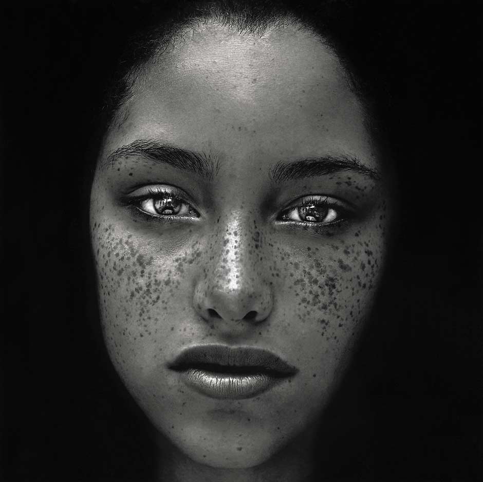
#1.
Do I like this this image?
I do like this image and the reason on why I do is purely because it stands out dramatically well with the sharp, detailed features.
How does it make me feel?
This image makes me feel quite sad as it seems to come across to me that the girl in the picture hasn't had the best of life's.
Does the image tell a story?
I think that this image does tell a story and I believe that it has got a deep, dark, mysterious side to it. This is because the girl in picture gives you that expression that she's in the 'shadows', always has been and always will be. I think it comes across like that purely because of how the image is laid out. To me, it looks as if she is stepping out from the 'darkness' and into the light to tell her story.
Was the photographer trying to get a message or particular feeling across to the viewer?
I think the photographer was trying to get a particular feeling across the viewers as this image makes you feel something, makes you think on what is the story behind it and why Penn published it the way he did.
The composition on this picture is called the 'rule of thirds'. The meaning by this a photographic composition and the 'rule' is to break the image down into thirds, both horizontally and vertically so you can have nine parts. As this image is a close up portrait, the subject then becomes the eyes which can fall nicely on the vertical lines.
Leading lines?
This image doesn't use lines to direct the eyes of the viewer, neither does it have any strong diagonals.
How is the light used?
The image has a hard light. I know this because a 'hard' light is basically referred to the image on having very harsh shadows with a sharp edge. Hard lighting is found where the lighting is direct, diffused and is not bouncing or scattered by objects or conditions. The flash on cameras is a hard light source, giving the portrait a more of 'dramatic' quality look.
Is the image 'flat looking' or very three dimensional?
The image is three dimensional. This is purely because hard light has a huge amount of contrast meaning shadows have harder edges and greater definition and hard light shots tend to look more 'three dimensional' than it would if the lighting was soft.
How is the space used?
The spaced is used brilliantly on this image as it makes it even more eye-catching with it not having too much 'negative' space so I think it compliments the image and the surroundings of the black background quite well.
Is the composition being followed or broken?
The composition of this image is being broken. I know this because the image is directly in the middle, drawing the focus of the eye to centre and this is one of the most common ways to break the rule of thirds.
 #2.
#2.Do I like this this image?
I do like this image and the reason on why I do is because this image is in the 'fashion' category of Penn's work.
How does it make me feel?
This image makes me feel ostentatious as it comes across that the image is there to 'impress' with it's 'old' fashioned and 'theatrical' feel.
Does the image tell a story?
I think that this image does tell a story and the reason on why I think this is because of how Penn takes majority of photographs of an individual person. All of Penn's 'fashion' category shows how much passion he's got for this single person, ''Lisa Fonssagrives'', his wife who stayed married until her death in 1992.
I think the photographer was trying to get a particular feeling across the viewers as this image makes you feel something with how passionate the images is.
The composition is used essentially, with how the 'blacks' and 'whites' merge one into the other, making the tonal contrast significant.
Leading lines?
This image doesn't use lines to direct the eyes of the viewer, neither does it have any strong diagonals.
The light in this image is used with a ultra-high contrast with sharp visual results making the image look dramatic.
How is the space used?
The spaced is used correctly on this image as it's not being surrounded in pointless, 'negative' space so it compliments it well.
Is the composition being followed or broken?
I think the composition on this image is being followed as everything seems to be well balanced and automatically draws you into the facial features first.

#3.
Do I like this this image?
I do like this image and the reason on why I do is because of how Penn has made the lips stand out with these different colours and made rest of the face dull and grainy.
How does it make me feel?
Does the image tell a story?
I think that this image does tell a story and the reason on why I think this is purely because of how each different colour is on one pair of lips. This makes me think that they're advertising this way because no matter what colour shade you 'like' or 'suit', we're all the same.
Was the photographer trying to get a message or particular feeling across to the viewer?
I think the photographer is trying to send a message across to viewers as this image is an advertisement for ''L'Oreal'' demonstrating all the lipsticks on one pair of lips to show the audience the different colour tones.
The composition is used well as everything in the picture is in a suitable place within the frame of the picture.
Leading lines?
This image doesn't use lines to direct the eyes of the viewer, neither does it have any strong diagonals.
How is the light used?
The lighting in this picture is used of a low contrast and a heavy grain. This shots are normally done on these kind of images as adjust and recreates an emotive style of 'high fashion' using black and white.
Is the image 'flat looking' or very three dimensional?
This image is three dimensional.
How is the space used?
The space is used correctly as it just focuses the viewers eyes directly onto the mouth as there is no extra 'negative' space going on which doesn't destroy that main focus.
Is the composition being followed or broken?
I think the composition isn't being broken on this image as everything seems well balanced with the lips being the main focus with nothing else in the background distracting the viewers the other way.
No comments:
Post a Comment